The logo adaptation
The reorientation of a brand, a changed service portfolio or the merger or spin-off of a company can be reasons for logo adjustments. A logo relaunch can also make sense if a change of attitude of a brand has taken place, e.g. due to a change in the company management. In the recent much-discussed examples of logo relaunches, it was probably a combination of many criteria: This refers to the logos of VW and BMW. Both companies opted for a clear and simple look for their logo in 2D - without any shadows or gradients.
Good preparation for your logo relaunch is half the battle
Do not follow every trend
Examples for a logo relaunch in B2B with Blaupause
Are you also planning adjustments to your logo? Then you should first develop a coherent concept for this. In the case of a logo relaunch as part of a repositioning, it is essential that you have already completed the strategic realignment of your brand and that the logo relaunch can build on a completed process. Often, a brand relaunch includes not only the logo, but the entire corporate design.
A good preparation on your logo relaunch is the half rent
Questions you should ask yourself as part of your preparations for the relaunch:
- What goals do we want to achieve with the logo relaunch?
- Are you striving for an image change?
- What associations and feelings should arise in our target groups?
- Do we distinguish ourselves strongly enough from the logos of our competitors?
- Do we want to be more concise?
- Do we want to achieve better readability?
- Would we like to make our logo more modern?
It is equally important that you define which elements of your old logo should not change so that the character and recognition value of your brand is not lost.
Follow You not every Trend
In recent years, there have been different trends in logo design: starting with geometric shapes, through handwriting to the latest trend, the simple 2D look. However, not every trend suits your company. It is much more important that your logo meets the following generally valid criteria and fits your positioning:
- Simple and memorable: You should be able to trace your logo easily in just a few strokes. Test to see if you can do it right the first time. If not, it is either too complicated or not memorable enough.
- Distinctive: Ask neutral people in your environment which brands they think of when they see your logo. This way you can find out whether there is a risk of confusion.
- Understandable: What associations do your target groups make? Test whether your target groups associate your logo with your company, your industry or your services.
- Reproducible: Whether very small in a browser tap or metre-sized on a trade fair wall - your logo must work on a wide variety of media in any format.
Examples for a logo relaunch in B2B with Blaupause
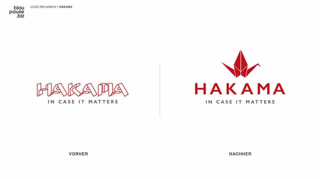
The Swiss company HAKAMA has completed an impressive transformation in its entire brand identity. Previously, the company positioned itself as a partner in thin sheet metal processing. This was also reflected in the logo, which depicts the brand name in letters bent from thin sheet metal.
After a strategy workshop with Blaupause , HAKAMA gave itself a new positioning as a leading industrialization partner for mechatronic assemblies and systems. It was time to replace the "Blechbieger" logo with a typeface that would be more concise and easier to read. The result: a simple lettering in the colors of the corporate design in combination with the key visual in 2D.


Yvonne Willmer
At Blaupause , my main task is to structure and manage complex projects for industrial clients. From time to time, however, I also write blog articles and social media posts on B2B topics that are close to my heart. Have you already put some of our suggestions into practice? Then I would be happy if you tell me about your results.

